Clean
Use purposeful space and remove unnecessary visual clutter.

NZ Hydrogen Design System
The approved styles, Sections, Frames and Components used to build and maintain the New Zealand Hydrogen website.
Unified reference · Version 2.0
Foundations
Use purposeful space and remove unnecessary visual clutter.
Structure information so it is easy to scan, compare and trust.
Use a restrained and efficient visual language.
Use strong typography and a precise, limited colour palette.
Build every page from approved styles and components.
Colour
#009EE3
#000000
#D9E1E4
#FFFFFF
Typography
H1: Main page heading.
H2: Major section heading
H3: Subsection heading
H4: Minor heading
Numbered hierarchy: Add numbered-h1, numbered-h2, numbered-h3 or numbered-h4 to build automatic nested numbers. A single-level number ends with a period, such as 1. Nested numbers have no final period, such as 1.1 or 1.1.1. Wrapped heading lines return to the normal left edge; no hanging indent is applied.
Skipped levels: Numbering inherits from the nearest active numbered headings. A numbered H3 immediately after a numbered H1 therefore becomes 1.1 even when there is no H2.
Starting number: On the first numbered heading in a sequence, add data-number-start="4" to begin that heading level at 4. This also works on H2 when an H1 appears above it.
Hidden number: Add data-number-hidden="true" when a heading should advance and pass its number to numbered children without displaying its own number.
Independent number: Add data-number-independent="true" to the first heading in a sequence that must ignore every active higher-level number. Following numbered headings at the same level continue independently, so the attribute does not need to be repeated on every sibling. Numbered children inherit from the independent branch. Add data-number-start="1" to reset explicitly to 1, or use another starting value. To deliberately return that heading level to the higher-level hierarchy, use data-number-independent="false".
Section Label: Supporting context
Lead Copy: A concise introduction in the NZ Hydrogen brand blue.
Standard Copy: Clear body copy uses the full width available from its parent component.
Highlighters: Yellow-green, Pink, Blue, Green and Orange fluorescent marker strokes for selected words inside ordinary copy.
Smallprint: Copyright, captions, legal notes and footnotes.
<p>Standard copy with <span class="text-highlighter">highlighted words</span> inside it.</p>
<span class="text-highlighter-pink">Pink highlight</span>
<span class="text-highlighter-blue">Blue highlight</span>
<span class="text-highlighter-green">Green highlight</span>
<span class="text-highlighter-orange">Orange highlight</span>

<h1>Page heading</h1>
<p class="author">By Mark Cain<br>10 August 2026</p>
<p class="lead">Lead Copy follows the author information.</p>

<h1 class="numbered-h1" data-number-hidden="true">Numbered parent with its number hidden</h1>
<h2 class="numbered-h2" data-number-start="4">Section starts at 4</h2>
<h3 class="numbered-h3">Numbered subsection</h3>
<h4 class="numbered-h4">Numbered minor heading</h4>

<!-- Skipped-level example: displays 2.1 with no H2. -->
<h1 class="numbered-h1" data-number-start="2">Second main subject</h1>
<h3 class="numbered-h3">H3 inherits from H1</h3>

<!-- Independent example: displays 1. and its H4 displays 1.1. -->
<h3 class="numbered-h3" data-number-independent="true" data-number-start="1">Independent H3</h3>
<h4 class="numbered-h4">Child of the independent H3</h4>

<!-- Independent H2 sequence: displays 2., 3. and 3.1. -->
<h2 class="numbered-h2" data-number-independent="true" data-number-start="2">Second section</h2>
<h2 class="numbered-h2">Third section</h2>
<h3 class="numbered-h3">Child of the third section</h3>
Responsive Delivery
Use these names when requesting responsive changes. A change assigned to one category is placed in that category’s dedicated responsive rules so the other three categories remain unchanged.
Up to 640px wide, with a separate compact-height exception for the named phone-landscape test.
From 641px through 900px wide. The 768 × 1024 test is the representative viewport.
From 901px through 1280px wide. This includes the 1024px landscape tablet and 1280px laptop tests.
From 1281px wide. The 1440px test is the representative desktop viewport.
Example instruction: “Make the Product Code smaller for Tablet Portrait.” Only that category’s responsive rules should change. Browser and real-device testing are still required because dimensions alone do not reproduce every rendering engine, touch behaviour or operating-system interface.
Page Structure
Authors describe the visible hierarchy. Containers, width limits and responsive layouts are handled automatically.
Place one clear comment immediately before every named Component. The comment states whether the Component is inside a Frame. This makes the visible page hierarchy easy to recognise when editing the HTML by hand.
<!-- Frame: Standard | Component: Product Hero -->
<div class="frame frame-standard component component-product-hero">
  ...
</div>

<!-- Component: Feature Icons — no Frame -->
<div class="component feature-icon-grid">
  ...
</div>
Use “no Frame” explicitly when a Component sits directly inside its Section. Do not leave Frame ownership to inference.
Section
The page background and blue swirl remain visible.
Section
A subtle white wash separates the page band.
Frame
An almost-solid white surface with a grey border, rounded corners and consistent internal padding.
Section Naming
Use the visible Section Label as the starting point for a stable Section ID, the optional floating Contents wording and a future interest category. This keeps hand-coded pages understandable while preparing them for navigation, personalisation and aggregate reporting.
<section
  class="section section-faded"
  id="technical-specifications"
  data-contents-label="Technical Specifications"
  data-interest-category="technical-specifications"
>
  <p class="section-label">Technical Specifications</p>
  <h2>Designed for practical mobile storage.</h2>
  ...
</section>Section Label is written for visitors and may be refined as the page copy develops.
Contents Label is the short wording shown in the floating Page Contents menu.
Section ID uses lowercase words separated by hyphens. Keep it unchanged so links and bookmarks continue to work.
Interest Category uses consistent terminology across related pages and remains inactive until consent-led personalisation is introduced.
The visible label may change from “Technical Specifications” to “Product Specifications”, but the established id="technical-specifications" should remain unchanged.
Breadcrumb hierarchy
Top-level pages use Home and the page name. A dropdown destination inserts its parent toolbar page between them. Deeper pages continue the same hierarchy. On a working page this path is normally hidden and is revealed by the document-shaped Page Path control in the main toolbar.
Styles
Use the small green Copy code button on a Copy Layout to place its editable HTML on your clipboard, ready to paste into a hand-coded page.
Copy Layout — Full Width
Use this name when standard copy should span the full available page width and wrap naturally within the site grid.
Copy Layout — Main + Support Right
The principal column wraps naturally and receives the greater share of available width.
The principal copy remains easy to edit and reflows automatically on narrow screens.
Copy Layout — Three Unequal Columns
Use for the main subject when three related but differently weighted pieces of copy appear together.
Use for supporting explanation.
Copy Layout — Three Column Flow
Long-form editorial copy can flow across three balanced columns. The browser moves the text to two columns and then one column as the available width reduces.
H1-H4 headings remain intact within one visual column. Unless a heading is the final element, it also stays with the opening lines of the content that follows it.
On Phone layouts, an image inserted directly into this flowing copy becomes a half-screen-width inline image with following copy wrapped alongside it. Its light-blue circular plus control expands the image to the full copy width and changes to a minus control so it can be reduced again.
This treatment is intended for background information, case studies and educational material rather than short component copy.
Authors can edit the text without manually dividing it between separate containers.
Copy Layout — Three Column Fixed
Each column has its own content block. Text remains in this column and never flows automatically into the next one.
Use this layout for three related subjects that must retain their individual headings, paragraphs, links or images.
On narrower screens, complete columns move to the next row and then stack vertically without mixing their content.
Use these names when specifying how an image should be displayed. The style controls the shape, corners, background and fit; the image content remains editable.
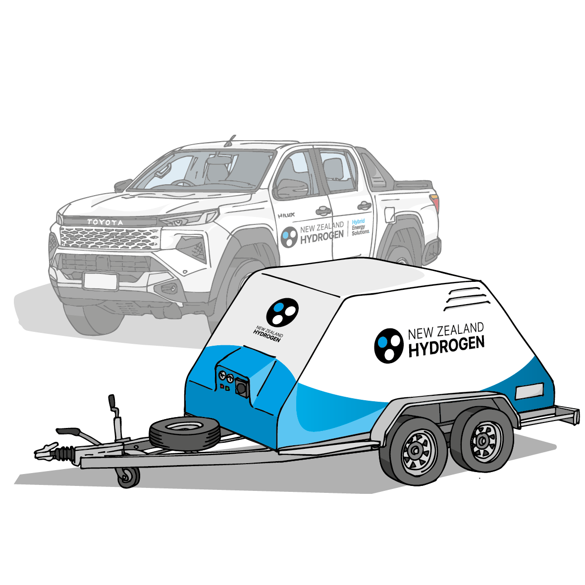
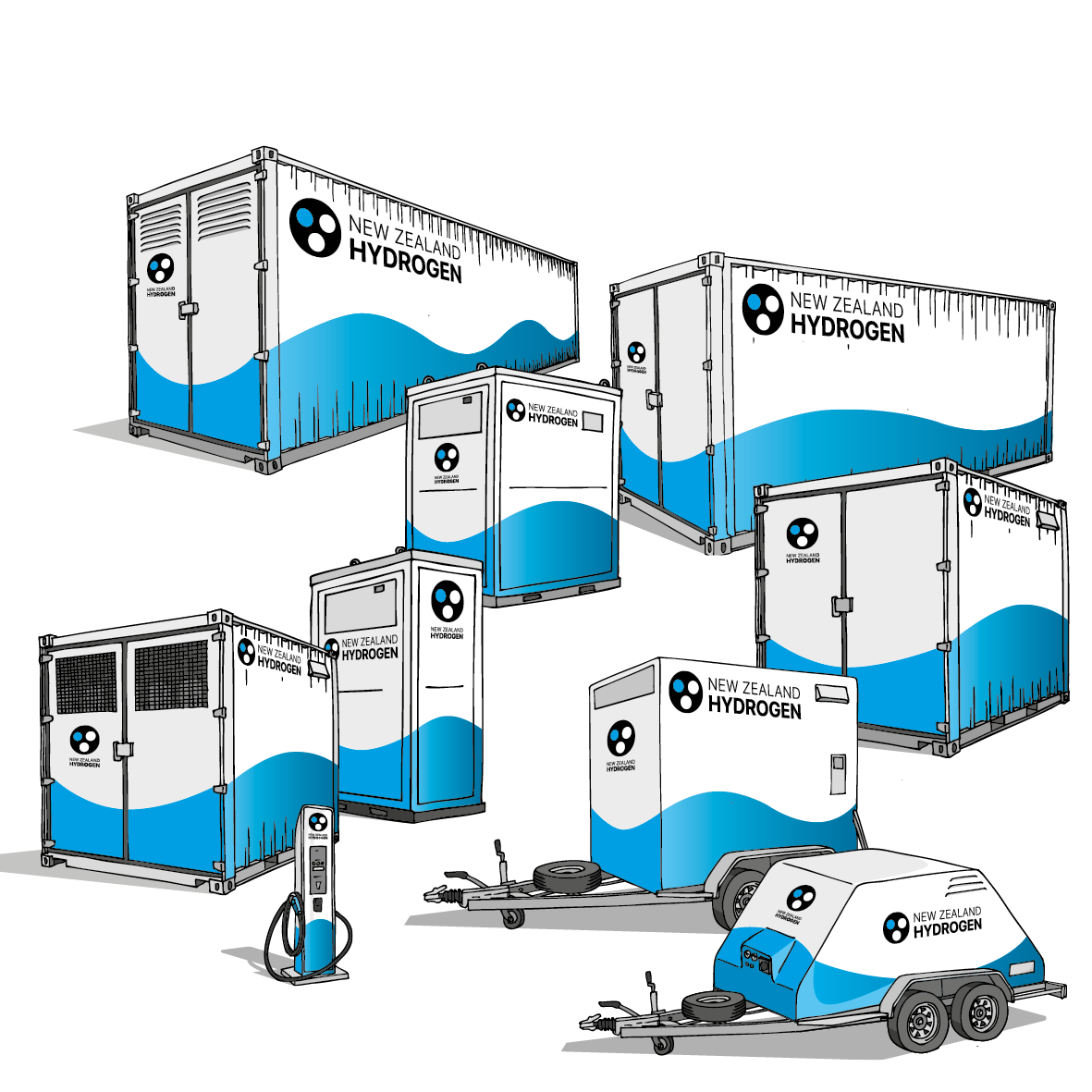
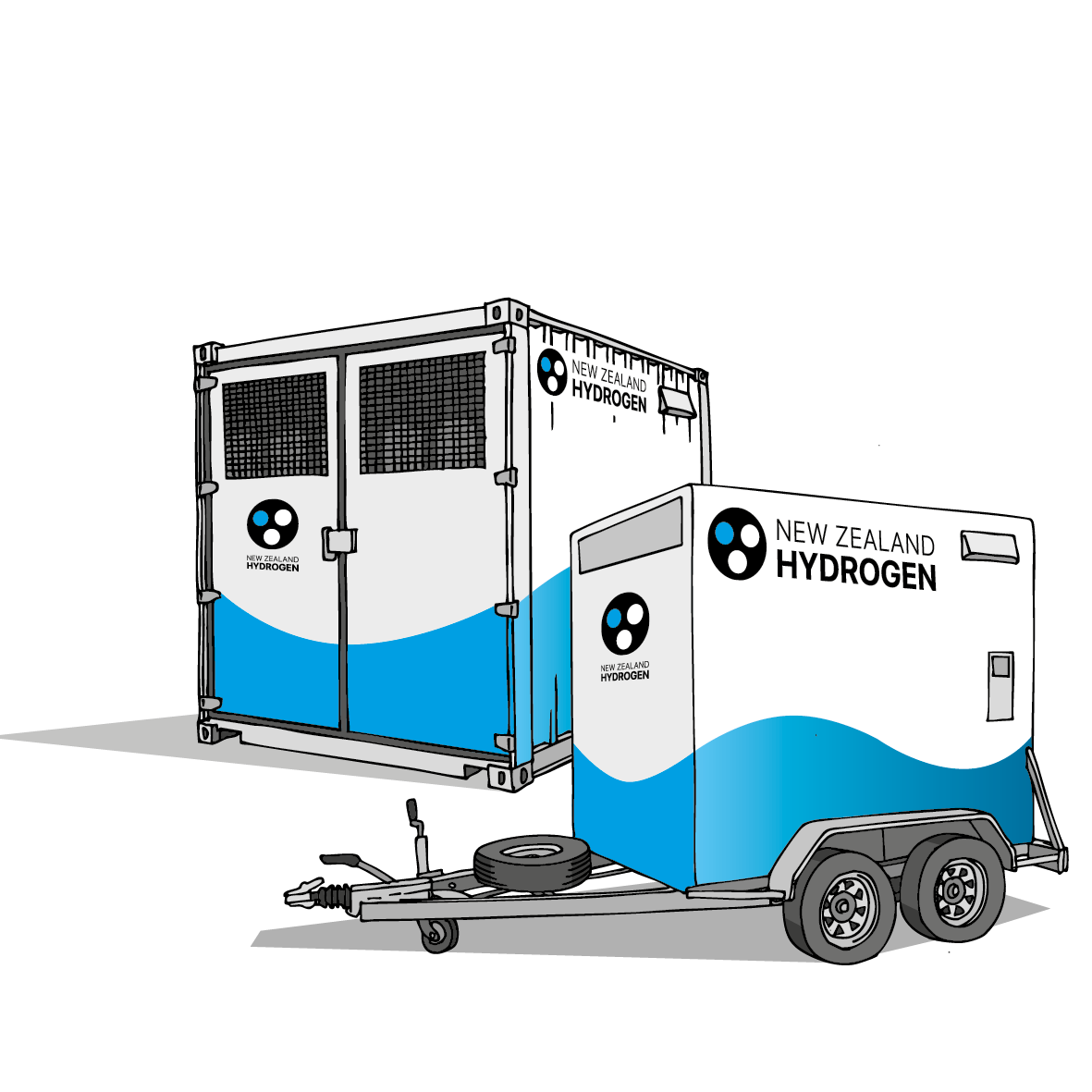
An experimental high-emphasis action inspired by the feeling of accelerating through space. Hover over the button or give it keyboard focus to preview the effect. Keep this component in the Design System as a reminder until an appropriate site action is selected.
Experimental component — not yet approved for general site use. Motion is automatically removed for visitors who request reduced animation.
Use this full-width blue horizontal line to create a clear visual separation between nearby content or Sections without adding a Frame or background.
<!-- Component: Blue Divider — no Frame -->
<hr class="blue-divider">
The divider automatically uses the NZ Hydrogen brand blue, with only a minimal half-rem margin above and below and no internal padding. Add it between content blocks, not as a replacement for a heading hierarchy.
Product Identity
NZH-M10
$24,950 NZD
Components
Green Copy code buttons copy the reusable component markup without the button itself or Design System-only sizing classes.
Hero Component
Powering a cleaner future.
A balanced hero with concise copy, clear actions and a square image.

Hero Component
Hydrogen systems built for New Zealand.
Two editable text columns introduce the page before a wide supporting image.
Use the right-hand column for supporting copy, a short list, key facts or actions. At smaller screen sizes this column follows the left-hand column.
Image and Copy
The Section Label, heading and copy begin level with the top of the accompanying image. Use this Component for explanatory content supported by a related image.
 Operating Power40 kW
 Weight420 kg
 Refill Pressure350 bar
 Storage Pressure500 bar
 Storage Capacity12 kg
 Production Capacity10 kg
 Water Required180 lt/day
Standard Card
A general-purpose card for supporting information.
Feature Card
A stronger treatment for information requiring emphasis.
The badge is always displayed at 15% of the width of the image container beneath it. This proportional rule applies consistently across desktop, tablet and phone layouts.


The first row is the table label or title and remains white. The second row contains the column headings on a light-blue background.
Example project schedule |
|||
|---|---|---|---|
| Date | Project stage | Location | Status |
| 12 August 2026 | Site assessment | Auckland | Confirmed |
| 28 August 2026 | Concept design | Hamilton | Planned |
| 15 September 2026 | Equipment delivery | Tauranga | Pending |
Use the FAQ Component for short questions whose answers can remain hidden until a visitor selects them. It uses native browser controls, so it works with touch, keyboard and assistive technology without extra scripting.
Green hydrogen is produced by using renewable electricity to split water into hydrogen and oxygen through electrolysis.
Hydrogen can be stored in purpose-designed vessels at pressures selected for the equipment, capacity and intended application.
Yes. Each question operates independently, allowing visitors to keep useful answers open while reviewing the rest of the list.
Use this component on longer product, Tools or Reference pages. It appears automatically when a page contains at least three Sections with both an id and data-contents-label. On Phone, Tablet Portrait and Tablet Landscape/Laptop, the labelled tab displays when the page loads and then reduces to a slim vertical indicator after three seconds. On Desktop it remains as the original labelled tab.
Three or more labelled Sections display the menu automatically. Add has-page-contents to the page’s <body> to force the menu on, or no-page-contents to keep it off regardless of the number of labelled Sections.
<body class="product-detail-page has-page-contents">

<body class="product-detail-page no-page-contents">Give the Section a unique id and add its short menu wording with data-contents-label. The menu is generated automatically in the same order as the labelled Sections on the page.
<section
  class="section section-faded"
  id="technical-specifications"
  data-contents-label="Technical specifications"
>
  ...
</section>Sections without data-contents-label are omitted. One or two labelled Sections do not trigger the menu unless it is forced on. Outside Desktop, the first click or tap on the slim indicator restores the Page Contents label and arrow for three seconds; a second activation during that period opens the full menu. Desktop opens the labelled tab with one activation. More than seven labelled Sections scroll within the open menu. When more links remain below the visible list, an animated blue down-arrow appears in the lower-right corner and disappears at the end of the list. The generator automatically adds (top) to the first link and (end) to the final link. The menu closes after a Section is selected, when the visitor clicks elsewhere, or when page scrolling begins.
Products & Retail
Use these named Components to take a visitor from a broad product category to an individual product and its detailed data sheet.
Level One
Links from the main Products page to a product-range page, such as Mobile Hydrogen Storage.
Level Two
Links from a product-range page to one individual product data sheet, including its code and price.
Use this compact card on the main Products page to introduce a category. Four can display across a wide Desktop page, reducing to two across in Phone, Tablet Portrait, and Tablet Landscape & Laptop. Introductory copy spans the full row above the cards. The square image sits flush against the frame and shares its two upper corner radii. Keep the optional Made in New Zealand badge, Section Label, range name, summary and “View the Range” action in this order. The card border and resting action strip use 75% grey. The action retains white text and a right arrow, changing to solid NZH blue with white text on rollover or keyboard focus.
Store Hydrogen Safely
Hydrogen supply that is built onto a trailer you can tow with a ute.
View the RangeUse this compact card on a product-range page to link to an individual product data sheet. Four can display across a wide desktop page and two display across a phone screen. The square image sits flush against the frame and shares its two upper corner radii. Keep the Made in New Zealand badge, product code, price, product name and “Full Details” action in this order. Across all four responsive categories, the border and resting action strip use 75% grey. The action has white text and a right arrow, a square top edge, and sits flush against the left, right and bottom edges. It is clipped to the exact lower corner shape by the card frame. In the Desktop category the strip height and link type are doubled; the other three categories retain the compact treatment.

Feature Icons, Made in New Zealand badges, Product Code, Price and specification Tables already form part of the product system. Future retail Components—such as availability, delivery, finance, comparison and purchase actions—will be added to this Products & Retail Section as they are defined.
Tools Framework
Each tool uses a reusable listing card, an individual calculator page and a shared mobile/tablet chooser.
Use the approved Product Range Card structure to list tools. Both the square image and the bottom action strip link to the individual tool page.

Calculator
Calculate how much hydrogen you will need to run a certain type and size of fuel cell power system.
Open Tool1
H1, Lead Copy, key inputs and a square supporting image.
2
Editable inputs, clear units, actions and an accessible result panel.
3
Explain the calculation and identify the assumptions visitors must verify.
4
Finish with limitations, engineering guidance and a relevant enquiry action.
Selecting Tools in the bottom toolbar opens a full-width menu from behind it. Selecting a tool closes the menu while navigating to that tool page. The menu height grows automatically as tool shortcuts are added, and incomplete rows remain centred.
Maximum four tool shortcuts per row.
Maximum seven tool shortcuts per row.
Maximum eight tool shortcuts per row.
Add each new tool shortcut once in the shared footer include. The chooser is hidden on desktop and uses a light grey halfway between the white bottom toolbar and the darker Page Contents tab. That colour continues behind the toolbar’s rounded corners.
Calculator Controls
Use these approved names and parameters when defining future calculators. The implementation can then remain consistent while the subject, ranges and calculations change.
The complete visual instrument: the black textured frame, nameplate, Display Screen, input controls and supporting calculator behaviour.
The standard results component inside a Calculator. Future tools should reuse its label/value alignment, units, responsive layout and accessible live updates.
The vertical rotating input control with visible neighbouring values, arrow buttons, inertia, reset gesture and an editable Step setting.
Specify these settings whenever a new Thumb Wheel is requested. An omitted Maximum creates an open-ended upper range. Width is automatic unless a manual minimum width is specifically required.
Thumb Wheel parameters | ||
|---|---|---|
| Parameter | Purpose | Example |
| Title | User-facing name above the control. | Peak Power |
| Units | Measurement displayed beneath the Title. | kW |
| Minimum | Lowest permitted value; negative values are supported. | 0 |
| Maximum | Highest permitted value; omit for an open-ended range. | 10,000 |
| Starting Value | Initial value and the value restored by a double-tap or double-click. | 0 |
| Step | Amount moved by arrows, wheel actions and each drum increment. | 5 |
| Duration Units | A Run Time Thumb Wheel can switch between Hours and Days without changing the internally stored duration or Calculator results. | Hours |
| Decimals / Detail | Optional two-decimal display for general controls. For Run Time, Hours offers Minutes in HH:MM format; Days offers remaining Hours in D:HH format. | Off |
| Width | Starts at the shared standard width and grows only when a displayed value requires more room. | Automatic |
| Inertia | Allows fast mouse or finger swipes to continue and decelerate naturally. | On |
| Accessible Label | Clear spoken description for assistive technology. | Electrical power required |
| Persistence | Future option to restore the visitor’s last permitted value. | Off |
<div class="component-thumb-wheel"
  data-title="Peak Power"
  data-unit="kW"
  data-min="0"
  data-max="10000"
  data-start="0"
  data-step="5"
  data-decimals="false">
  ...
</div>Optional calculator setup choices are placed on textured cards stacked behind the Calculator. An upward triangle reveals their titles, and selecting a title brings that card forward. Select System updates or clears the System Name. Power Usage Profile provides separate hourly graphs for up to seven numbered days, with Copy to All for repeating the active day. The available Day buttons follow Run Time, a partial final day shows only its applicable hours, and longer Run Times repeat the configured seven-day profile. Its Step may use whole values or two decimal places. A separate circled question-mark control exclusively opens the reusable User Instructions card.
Each Thumb Wheel retains its compact Step button. Selecting it extends the bottom of the Calculator with one shared editor rather than opening a floating popup. The value field sits beside the control label, while equal Cancel and Set buttons complete the bottom row. A Run Time editor also offers Hours or Days; its detail option automatically changes between Minutes and Hours.
Before additional calculators are released, define the Display Screen’s standard nameplate, result rows, emphasis levels, unit formatting, responsive stacking and optional status or warning messages as a reusable component.
Forms
Layout B
Discuss your project.
A focused contact-page Hero with H1 and Lead Copy on the left and a stripped-down form on the right.
Galleries
Each gallery can contain any number of images. Open one card, then use the arrows or keyboard to move through that collection.
Call to Action
A focused final action with subtle blue swirl artwork and one clear button.

